The Campaign Analysis page for the AI Offer Decisioning Agent (formerly Self-Optimizing Campaigns) provides you with both high-level and drill-down perspectives on the performance of your AI Offer Decisioning Agent, including the dynamics of individual subgroups being optimized within the campaign. Let’s take a look at each area of the page.
Optimization Benefit
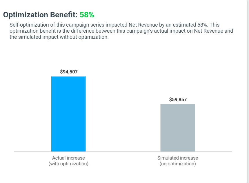
This chart presents the optimization benefit, meaning the difference between the campaign’s actual impact on the optimization KPI and the simulated impact without optimization. This chart presents two bars:
Actual Increase– The blue bar on the graph represents the campaign’s actual increase. This means the aggregated uplift generated by the campaign during the selected time period, based on a comparison of all test group and control group responses (just like a standard recurring campaign).
Simulated Increase– The grey bar represents a simulation of the increase that the campaign would have generated, without any of the adjustments made to the campaign by the AI Offer Decisioning Agent algorithm.
To illustrate, let’s examine the following chart, which clearly compares the uplift improvement of this AI Offer Decisioning Agent, resulting in an Optimization Benefit of 58%. In this case, the AI Offer Decisioning Agent algorithm adjusted the weights of the Actions for each customer cluster, resulting in an actual increase of $94,507. If this campaign had been run as a regular A/B/n test, the campaign’s growth would be estimated to be only $59,857.
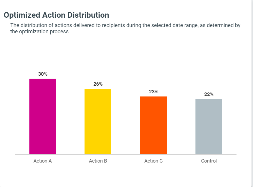
Optimized Action Distribution
This bar chart shows the average distribution of each action, as determined by the optimization algorithm, across the campaign’s Target Group. This specific example presents a campaign that contained three competing actions. In this case, the AI Offer Decisioning Agent algorithm adjusted the weight to the most effective action (action A), targeting 30% of the Target Group customers.
The AI Offer Decisioning Agent Process
Most Target Groups can be broken down into smaller customer clusters. Even small and seemingly granular Target Groups – such as Active VIPs – can usually be broken down in various ways, including age, gender, geographical region, past week's experience, and past month's spending, among others.
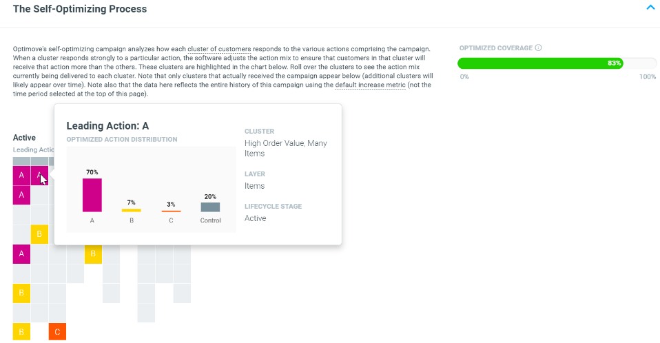
A particular cluster becomes important when Optimove observes that it responds to Actions differently than the overall Target Group does. This portion of the Campaign Analysis page allows you to peek into the granular clusters to which the AI Offer Decisioning Agent algorithm is paying special attention.
Understanding the layout
Each cluster targeted by the campaign is represented by one square. Squares are positioned so that similar/related clusters appear together. For example, all clusters belonging to the Active lifecycle stage are kept together (e.g., all Active customers with RFM1, all Active customers with RFM2, all Active customers with a good experience, all Active customers with a bad experience, and so forth). This layout lacks a meaningful X-axis or Y-axis; it’s simply a logical way to present the various clusters.
Note: Overlaps between clusters are ignored.
For example, if Active > RFM1 and Demographics > Men are each represented by a square, customers who are in both RFM1 and Men (i.e., they overlap these two clusters) will not be presented in the display. (Investigating specific overlaps between clusters can be done in the Customer Explorer.)
Understanding the coloring
Grey squares represent identified clusters that are not receiving specialized optimization, either because not enough customers responded or because their responses to the various actions were not significantly different.
Colored squares represent clusters for which specialized optimization is occurring. The letter displayed indicates the most effective action for that particular cluster. Hovering your mouse over a square reveals the current action mix for that cluster, plus additional details.
Performance by Action
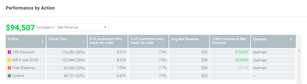
This table presents some details regarding each marketing Action, including the uplift generated by each one. Unlike the sections above, which use the campaign-default KPI, you can choose which metric is presented.
List of Customers
This final section of the page allows you to view and export (as a CSV file) the list of customers who responded to a particular Action.