
After creating a stream, measuring and analyzing your results is key to determine which strategy achieves your long-term business goals.
In this article, we will go through the Stream Analysis page and how you can leverage each data point to optimize your streams.
How to Access
- Under the Plan tab, go to Streams
- Once the stream is in ‘Running’ status, you will already be able to analyze its results by clicking on the three dots and then Go To Stream Analysis
Results
Winning Treatment
Under the Treatments section, you’ll be able to see which treatment is winning in terms of generating the highest Increase based on your chosen KPI in comparison to the other treatments.
Based on this insight, you can then decide to shift the entire target group to the winning treatment to ensure you only execute the treatment that will generate the highest incremental impact.
Optimove calculates the uplift of each treatment against the stream's super control group. The super control group contains the same customers throughout the stream's occurrence, allowing for the most accurate uplift calculation.
Keep Treatment:
To disable the other treatments and retain only the winning one, click the blue button on the screen and confirm your choice to move all customers to the winning treatment.
Once confirmed, the other treatments' campaigns will stop, and the Stream will adjust its end date to match the winning treatment's remaining schedule. Going forward, the Stream will deliver only the winning treatment — customers who were part of other treatments will exit the Stream, and new customers entering the Stream will be directed toward the experience that drives the highest uplift.
Note: this action cannot be undone. Once a treatment is kept, the other treatments are permanently stopped.
Please note: Customers in the super control group will not receive any campaigns throughout the entire duration of the Stream. During this time, they will only be able to receive other campaigns if the campaign uses ‘Include All’ as the exclusion type.
No-Winner Scenarios
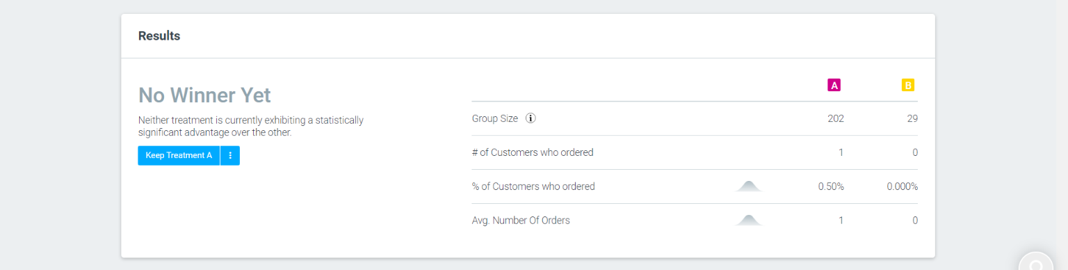
In some cases, there won’t be a statistically significant winner, meaning that additional data is needed before Optimove can determine if one treatment performed better at achieving the selected objective. This could be due to one or more of the following reasons:
- The stream is still running and not enough data has been collected to reach a statistically significant result. In this case, let the stream continue to run until a winner is declared.
- The stream has accumulated sufficient data, but neither treatment is performing significantly better than the other. In this case, consider running another stream with a broader date range or group size to gather more data.
KPI Comparison
While you set your stream with one KPI in mind, it’s important to look at the bigger picture. By analyzing your streams against multiple KPIs, you can determine how each treatment impacts different business goals.
In the graph, you can see the Increase generated from each treatment for each KPI, as well as which treatment is winning.
For example, as a retail brand, you may want to see how different treatment performs in terms of improving in-store orders compared to web orders.
You can also use the KPI comparison to see which treatment truly generates the most revenue. For example, you may be looking at which treatment is winning in terms of the number of orders generated. As a result, you would assume this treatment is revenue maximizing.
However, if this treatment is also winning in the number of discounted orders being generated, then this may not be the case. Therefore, you want to take this KPI into consideration when deciding which treatment to move forward with for future streams.
In addition, you can view a detailed breakdown of responses for deeper insights.
Cumulative Impact Graph
Use the cumulative impact graph to understand how each campaign within a treatment is performing. Based on these insights, you can identify trends in campaign performance over time.
In the chart, colored circles signal the days where a campaign was sent to the customer, while blank circles signal that no campaigns were sent to the customer on that day.
In order to see the impact of the campaign you can hover over the dot. This will show the cumulative average increase generated by the campaign based on your chosen.
You can choose to view the impact chart in two views:
1. Days In Stream
If you are running a recurring stream, each colored dot will signal the cumulative average increase of the campaign.
Let's say you have a stream recurring every day, this means that each day a new set of customers that matches the target group criteria will receive the first campaign in the stream.
Using the Days In Streams tab, you will see the average uplift of all customers for each day in all occurrences, including days where no campaign has been executed.
2. Start Date
You can also view the impact chart by Start Date. This allows you to analyze the impact of the stream for a closed group of customers that were targeted by a specific stream occurrence.
In the example below, the chart focuses on the Stream executed on the 20th March.
Please note: this tab is only relevant for recurring streams.
The Campaign List View provides a clear visualization of each campaign you have set up in each treatment and how it impacted your stream using multi-touch attribution. Here you can view all the campaign details such as the channel, number of customers targeted and the Increase each campaign generated.
In the final column, you can see the multi-touch attribution of each campaign, which measures how each individual campaign contributed to the overall uplift of the stream.
We measure the multi-touch attribution of each campaign using the control groups of each campaign in the treatment
For example – let’s say I created a Stream with one treatment of three campaigns (A, B, C).
We would first calculate the uplift of each individual campaign using standard control groups per campaign:
- Campaign A = $17,000 uplift
- Campaign B = $40,000 uplift
- Campaign C = $10,000 uplift
We then sum up the uplift of each campaign, which totals to $67,000 uplift.
We then calculate the relative contribution of each campaign to the overall uplift of the Stream:
- Campaign A: 25% ($17,000/$67,000)
- Campaign B: 60% ($25,000/$67,000)
- Campaign C: 15% ($10,000/$67,000)
Using this metric, you can see the true impact of each touchpoint in the stream so that you can determine which campaigns need to be optimized or even removed, or which high performing campaigns you could use as standalone campaigns in your marketing plan.
Top 100 Customers
The Top 100 Customers section in stream analysis showcases the top 100 customers who have responded to a specific campaign action. It provides insights into customer behavior, allowing marketers to identify the customers with the highest response rates based on the selected customer attributes. You can export the full list of customers from both treatments for deeper analysis.